
Coming off of what may be considered one of the more volatile weeks of the year thus far, it’s always prudent to take a look at the market with a bird’s eye view. For those of us who watch the market’s every tick during the day, it’s easy to get lost in the noise. At least once per month, or after a “price shock” event it is necessary to take a step back and listen to what the market is telling us. The following are examples of some of the homework I do to tap into the pulse of the global financial market.
A. AAII Investor Survey
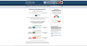
Each week the American Association of Individual Investors publishes a survey detailing investor sentiment (where they think the market will be in 6 months) and compares the numbers against the historical average. This past week showed once again an increase in the percentage of bears and a decrease in the percentage of bulls. To summarize, investor optimism is very close to the bottom of its historical range while pessimism is very close to the top. Because this survey has been known to be a good contrarian indicator historically, I would conclude from this one data point that pessimism has gotten overdone, and we should expect a rally or reversion back closer to the mean.
B. (HYG/LQD) High Yield vs. Investment Grade Bonds
Though there was an exogenous event (U.S. Missle Attack on Syria) High Yield Bonds continued to outperform investment grade bonds on a relative basis. If investors would have been more worried, chances are we would have seen just the opposite. In periods of extreme uncertainty, high yield or junk bonds is not traditionally where you would want to put your money to work.
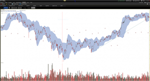
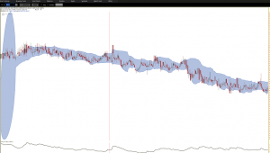
C. $SPX Speed / Volatility
Taking a look at a 2 year chart of the $SPX with ATR, (at the bottom) there was no indication of an uptick in speed that is sometimes displayed when the market expects a period of higher volatility and a corresponding market pullback. The Bollinger Bands showed little widening and ATR showed no significant increase.
D. Uptick in $XLU, $TLT, or $XLP (Flights to Safety)?
Nope.
E. Uptick in Correlation Among Stocks As Shown by the CBOE Correlation Index?
Not that either.
F. NYSE Composite and NYSE Percent of Stocks Above 200 Day MA
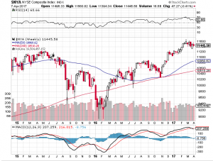
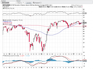
This is something we will want to pay attention to. While the NYSE Composite Index has continued an uptrend (bullish), the number of stocks in the index above their 200 day moving average has experienced a bit of a decline and is sitting right on the 50 day moving average. I wouldn’t call this a true bearish divergence yet but something to keep an eye on.
G. Performance Chart (U.S. Indices / Gold)
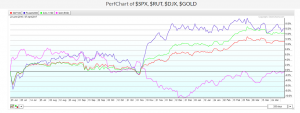
Gold continues to under perform the major U.S. Indexes and experienced no significant uptick recently which one may expect in an environment such as we had last week.
The above is a sample of some of the things I look at several times each month to keep in tune with the overall sentiment of the markets. While the majority of my trading is done in U.S. equity options, it will always be beneficial to have an overall sense of money flow between asset classes. Keeping track of the examples above will assist you in building out your overall framework or outlook of how investors are positioning themselves for the current and expected market environment.