At the start of each week I like to make reference to an RRG Chart to gain a sense of the overall investing landscape. Relative Rotation Graphs are a unique and powerful tool to visually see flow of funds and relative strength of individual securities, commodities, ETFs, or really anything with price history relative to a benchmark such as the S&P 500. If you aren’t familiar with how RRGs are interpreted you can have a look at a post I did some time ago that details how to use them at a basic level:
Interpreting Relative Rotation Graphs
Better yet, take a look at a video done by my friend and mentor Mathew Verdouw, CMT, CFTe on the use of RRG.
RRG Webinar (Lower 3/4 down the page)
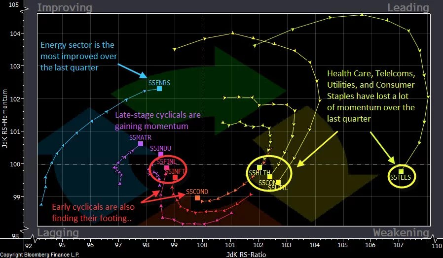
With a basic understanding of RRGs you have at your disposal a simple, yet extremely powerful tool for visually displaying sector rotation as it happens in real time. Here is a quick look at a daily RRG compiled this morning as of the close of trading last Friday:
At the most basic level, you want to be involved in sectors that are in the upper right quadrant from the long side. Another approach is to allocate into those sectors that are making a move into the upper right “Leading” quadrant from the upper left quadrant.
From this morning’s RRG we can see that we want to be long names in a few different areas: $XBI Biotechs, $KWEB China Internet Stocks, and we will be looking to add Financials as $XLF is approaching the leading quadrant. We want to lighten up on names that have moved out of the upper right quadrant and sell any that have rotated into the bottom left lagging quadrant.
As an options trader, I rarely buy an ETF because I feel I have spent enough time perfecting my edge and have the ability to pick individual names that will outperform the ETF itself.
At this stage from the $XLF I am already in, but interested in adding to $GS Goldman Sachs, from $KWEB I have $BIDU calls, and from $XBI I am looking to add a name or two but have been in $BLUE for some time.
If you are interested in testing out RRG Charts you have a couple of options… They have a very basic version of them for free at www.stockcharts.com (Only useful to get a sense of how they work)
For a more usable version of these you can register for a free account (free for now) here:
https://www.relativerotationgraphs.com/
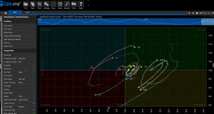
For the Professional Version which I have above you need to have either a Bloomberg Terminal or my preferred method which is Optuma with a data feed called IQFeed.
With Optuma and IQFeed you aren’t limited in the securities or asset classes you can chart. You can change the benchmark, and plot any security that has price history whether it be stocks, futures, options, Forex, bonds etc.
Utilizing RRGs has made my life a lot easier. I no longer have to look through charts symbol by symbol, or even two symbols at a time as I do when I do ratio analysis. RRGs give you the ability to chart a theoretically unlimited number of securities against each other and against a benchmark, all in one easy to read graph. If you aren’t currently employing RRGs in your workflow, I really think you are at a disadvantage. I highly recommend talking to the guys at Optuma to learn how this analysis can benefit you in your trading.