
Inevitably, when we wake up to a pullback in the stock market such as we have today, fear sets in. After months of near uninterrupted gains you login to see your account balances dip, and your mind starts to race as you figure out how you are going to explain to your wife the sheer stupidity of your investment plan. I should know, I’ve had this talk many times.
The good news is, there are a few tools you can utilize to help gauge the health of market and keep you on the right side of the trade. Some are more applicable than others depending upon your trading or investment time horizon, but nevertheless can be helpful. A few tools I employ are as follows:
A. $COPPER:$GOLD Ratio Chart
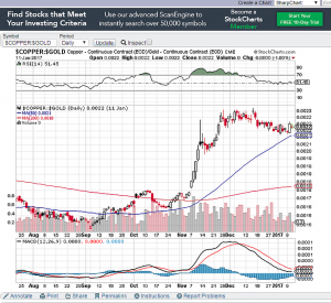
Copper is a base metal with wide application in our economy. Electronics, homes, power generation and transmission all rely on copper. Due to its reputation and history of predicting turning points in the market, it has been known as Dr. Copper. In a general sense, rising copper prices indicate a thriving global economy. Gold on the other hand is a safe haven commodity (a form of currency some say) where people hide in times of uncertainty or market turmoil. When you have copper outperforming gold on a relative basis, as shown in the chart above, chances are stocks are going to follow. Following a fairly violent upswing at the end of 2016, this ratio began to consolidate. It recently bounced off the logical 50 day moving average and put in a nice bullish candle.
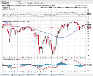
B. % Of Stocks Above Their 200 Day Moving Average
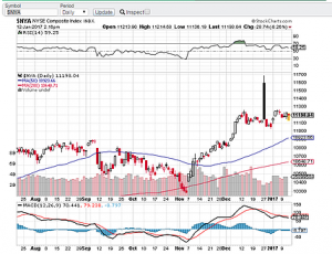
This is a market internal indicator that measures breadth. If you have a market index trading up (higher highs and higher lows by definition) you want to see a high percentage of stocks participating in the rally. You can go over to stockcharts.com and enter in two symbols: $NYA200R which is the percent above 200 day MA and $NYA which is the NYSE Composite Index. You want to both of them trending together to signify a healthy uptrend. Overall, both are in an uptrend.
Sectors. I did a post on this recently: $XLY/$XLP C. Relative Strength of the Consumer Discretionary to Consumer Staples
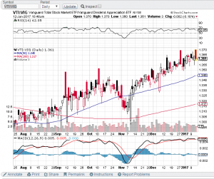
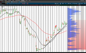
D. $VTI:$VIG Relative Strength
Vanguard has two ETFs that are worth keeping an eye on to monitor market sentiment. The $VTI is a total stock ETF and $VIG is a dividend appreciation ETF. In pull backs or market contractions, investors will often rotate into safer, dividend paying stocks. The ratio of the $VTI/$VIG should, in theory be in an uptrend to signal investor confidence.
E. NYSE TICK Statistic (Other TICK Indicators as well such as Russell, NASDAQ etc). This is a simple measure of intraday internal strength as measured by the number of NYSE stocks on a downtick subtracted from the number of NYSE stocks on an uptick. Depending upon the market environment we are in and the relative level of volatility, I may watch for TICK readings of Plus/Minus 1000 in a low vol environment or Plus/Minus 1200 in a higher volatility environment. There are literally hundreds and hundreds of market internal stats. Find a few and back test them to see if they are of relevance to your trading style.
F. Strength In China. China’s economy is hugely important in the Global Markets. Remember the start of 2016 when China’s Shanghai Stock Index plunged 7% in one day and sent your portfolio cratering through the floorboards? I do. For that reason, I like China in a nice, slow stable uptrend.
This list is by no means exhaustive of anywhere near the number of tools we have at our disposal to monitor the strength of the market. The majority of the above are used at a more macro level, bird’s eye view. I keep an eye on these weekly, just to make sure we aren’t seeing any major divergences where we shouldn’t be if we expect an uptrend (or downtrend) to continue.
As the market environment changes, I will do a follow up post to this, a part two if you will covering other market statistics, relative strength ratios and general indicators you can use to keep you out of harm’s way.
I am off to watch the close.
Ciao.