
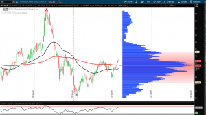
Our friend over at Nanex, Eric Hunsader posted the following chart on his Twitter feed this morning:
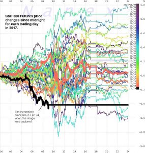
This shows the S&P 500 Futures the most down since midnight of any trading day so far in 2017. I monitor this chart in particular to get a sense of the overnight buying/selling pressure. Anytime you get a major low (or high) I take note and want to do some additional homework to see if overall market conditions are changing. Let’s take a look at some of this “homework” to get an overall sense of the investing landscape.
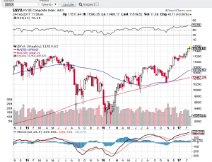
A. $XLU Utilities ETF
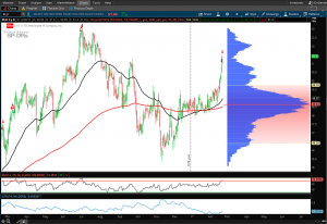
Utilities as a group has been on a tear for the past 10 days. Both the 50 and 200 day MAs have begun to slope up as the group as a whole has broken out of its recent consolidation range. As the utility stocks are generally seen as a less volatile safe haven for investors it is something to keep an eye on. Although I would be much more likely to be short $XLU at these levels, it is interesting to see the group making such a move as the broader stock indexes make new highs.
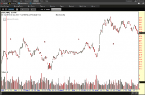
B. Gold
A quick glance at a chart of Gold may remind you of $XLU. The commodity has run from $1150 to $1260 in 2017, perhaps as investors face “uncertainty” and are using the commodity / reserve currency to hedge current equity exposure. Whatever the reason, Gold is a safety play and is in a strong uptrend thus far in 2017.
C. The NYSE Comp. and NYSE Stocks Above 200 day MA.
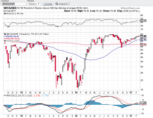
We like to see these both making new highs, which so far they continue to do. Pay attention to negative divergences here for possible market pullbacks. When you have a week when the $NYA makes a new high but the $NYA200R doesn’t follow, you can make a case for a near term pull back in stocks.
D. $XLY/$XLP
The ratio of Consumer Discretionary relative to Consumer Staples is one in which we like to see increasing if we expect market strength to continue. The ratio chart has been flagging and needs to hold current price levels, (I think) if we want to see resolution to the upside.
E. Top Industries this week
The top industry performers this week are utilities and financials. Financials have priced in a rate increase and utilities are again a group used for portfolio diversification, away from higher beta equities. This signals that investors have less appetite for risk this week.
F. $HYG/$LQD
he ratio of High Yield Bonds to Investment Grade Bonds is another barometer of risk I keep my eye on. As equities continue making highs we like to see this chart confirm. It is following a nice uptrend so far, confirming a risk on environment for the time being.
G. China $FXI
The $FXI tells the China story as it tracks the 50 largest Chinese stocks. “The rest of the world does better when China does better” is a theme you may often hear. While the ETF is in an uptrend, it is printing more of a bearish candle on the week. One candle however is no real cause for concern yet. We will watch to see how it trades next week.
H. $VTI/$VIG
Vanguard’s Total Stock Market Index / Dividend Appreciation Index is one other ratio I follow to get an overall sense of risk appetite in the market. So far, the uptrend is intact.
I. CBOE VIX
The market fear index isn’t fearful. Continuing with the lack of volatility, market participants don’t seem to be concerned of any imminent pullbacks judging by the buying and selling of SPX Options.
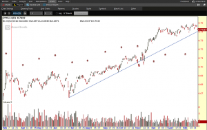
J. $FTSE 100
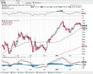
The FTSE 100 London Financial Times Index is another index I keep on my screen as a gauge of what is going on in the European Markets. It is interesting to see the Index bounce right off the upsloping 50 day MA. This is a bullish sign for the LSE.
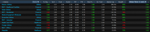
K. Advancers and Decliners of Major US Indexes
Finviz has a very basic tool on the main page I like to use that shows the percentage and number of stocks above relevant moving averages and advancers and decliners of the index.
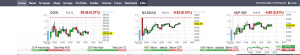
We can see that there is a larger number of stocks making new highs than lows, and that around 70% of the market continues to trade above the 50 day MA. This is a stat to track weekly as it helps in relative comparison of what the underlying stocks are doing within the index.
This is a sample of some of the analysis I do towards the end of each week to keep a pulse on the global markets. There are hundreds of charts to keep an eye on both in the U.S. and Globally to gain a fundamental feel for the kind of market environment we are in. The above are ones I look at every single week that I have found work well to distill or provide a synopsis to the overall environment we are in. In sum, I don’t believe there is any real cause for concern that a significant pullback is around the corner. However, I do think the market may take the coming week(s) to digest the recent gains and begin to consolidate, perhaps lower. The landscape continues to provide a trading environment that fits my style of taking advantage of rotations. That will continue to work, until it doesn’t.
@omahacharts
[email protected] with any questions, concerns, hate mail, what have you.
Good day.