
Intermarket Analysis is a technique developed and made popular by John J. Murphy. This branch of Technical Analysis looks at the Global Markets as an interrelated system in which a measurable correlation exists between asset classes. Specifically, the correlations between the 4 major asset classes are examined:
Stocks
Bonds
Commodities
Currencies
This analysis of more than one related market at a time is a powerful way to determine the relative strength of one asset class to another. Instead of looking at stocks in isolation, or commodity prices by themselves, this method allows us to compare associated asset classes to determine where to allocate funds on a more macro level. Once we have diagnosed which asset classes exhibit relative strength, we can drill down into the individual sectors of the stock market, or bonds/commodities/currencies we are interested in.
What’s more, Intermarket Analysis helps identify the stage of the business cycle and thus investing cycle. Since developing a firm understanding of this technique, I have been able to construct a much more clear world view without having to bore myself with tedious economic reports and other outdated methods of fundamental analysis. With a little study, you could use Intermarket Analysis to outperform the Mutual Funds or Target Date Funds that your 401k most likely has you sitting in.
Still not impressed? Intermarket Analysis predicted (and I would argue with ease) the crashes of 1987, 2000, 2007/2008. While the rest of the World was world was devouring stocks and lavishing themselves with exorbitant gifts of degeneracy (read Hookers and Blow), Intermarket Analysis was warning us all and telling a different story. Unfortunately, few listened.

The good news is, we can listen now and pay attention to these relationships. While there are a number of inflationary and deflationary relationships that are well known, I won’t get into those here. One relationship I have been looking at is that of Consumer Discretionary and Consumer Staples via the $XLY and $XLP Sector SPDRs. Enter the Ratio Chart…
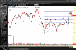
The above chart is the ratio chart (relative strength) of the Consumer Discretionary Sector/Consumer Staples Sector. The $XLY (Consumer Discretionary) ETF is a basket of stocks considered as non-essential items by consumers, but desirable if they have expendable income. The $XLP (Consumer Staples) is a basket of stocks which are essential products consumers won’t cut from the budget no matter their financial situation (think food, household cleaning items, etc)
When the $XLY is increasing we are confident about our financial situation and buying more unnecessary but desired goods, like my beautiful wife does everyday with her Amazon Prime account. When the $XLY is decreasing, our confidence is weakening and we are saving money, paying off debt, and buying the bare essentials.
Take a look at the ratio chart above: ($XLY/$XLP) In early-mid November we saw a “yuugggge” break to the upside in the strength of Discretionary relative to Staples. We felt confident about our prospects of having extra coin in our pocket, and bought stuff we didn’t need. Some might speculate that was due to a Trump election. Perhaps, but this is a politics free blog. 🙂
A closer look shows a defined uptrend, and most recently a setup of one of my favorite patterns to trade: A falling wedge into a Fibonacci Retracement Zone. This coupled with the flagging pattern could be the calm before the upside storm so to speak. A drop down to 1.55 in the XLY/XLP would be my ideal entry point as it coincides with the 38.2% Fib Retracement. (General use of market patterns works great with Intermarket Charts – in most cases Intermarket Charts LEAD individual equity / commodity charts)
What’s the bottom line? I think an upside move may be setting up for Q1 2017 in the ratio of Consumer Discretionary to Consumer Staples, which should bode well for the overall equity markets. I think our risk appetite is strong and while there is an overall “unknown” with a new candidate coming into office, we are generally bullish on stocks – and life. Should this ratio start to slip back to the 1.40-1.45 range we will need to reevaluate. I would consider this call to be wrong at that point.
It could happen, but I doubt it.
@omahacharts on Twitter