
For market technicians, there is no shortage of tools and indicators we have at our disposal. With today’s computers and rapidly changing technology, long gone are the days when a chartist would come home and plot the Open, High, Low and Close of a stock or commodity on graph paper by hand. Now we have software platforms with laundry lists of technical tools from which we can choose. We’d be hard pressed to find any technical analysis platform that didn’t include in the neighborhood of 100 or more studies, both traditional and proprietary. So when it comes to the seemingly never ending list of tools, how do we know which ones can help us meet the number one goal we should all have in this industry? Make money while controlling risk.
I’m glad you asked… You do a lot of testing, retesting, back testing, and then you test some more. These tests over time begin to reveal the viability of certain tools and indicators and how they work in different market environments across different asset classes and with different timeframes.
What don’t you do?
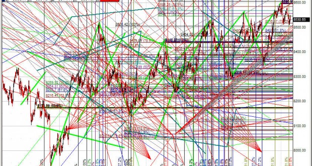
Load up a chart like this…
What else don’t you do?
Start using new trade methodologies and indicators you aren’t familiar with and haven’t tested with real money. I am not going to risk capital using Gann and Gartley tools when I haven’t spent ample amounts of time testing them.
In all my years doing this, I have come to the conclusion I could survive off of two tools that are included in most every platform available today: Price and Volume Profile (aka Volume by Price).
Everyone uses price. It’s the end all be all truth to what is. Strangely enough, I see very few traders, novice all the way up to professional using Volume Profile. I credit most of my knowledge of volume profile to my friend Morad Askar. Many of you know him by his Twitter handle @futurestrader71. Back in about 2011 I enrolled in a webinar in which he was teaching futures trading techniques using one single indicator. There were no RSIs, Stochastics, Moving Averages, etc. Just auction theory and volume profile. I had been familiar with this approach but underestimated the usefulness. FT made it clear that not using this puts you at a disadvantage and ever since it has been a mainstay on my charts.
I won’t go into a full lesson on using volume profile as it is beyond the scope of a single blog. I highly recommend if you want to learn more that you reach out to FT71 on Twitter. He has a course you can download and view on your own time. I am going to give you a synopsis of this technique with some examples that I think will get you started.
Exhibit #1.
$BEDU
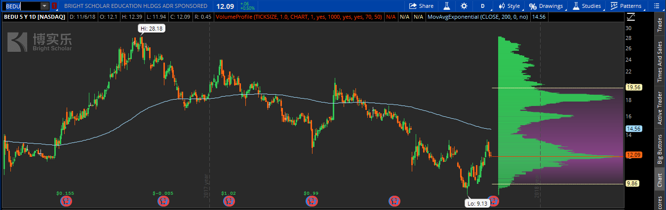
BEDU has the makings of an inverse head and shoulder pattern which is bullish provided you have a confirmation indicator. Technicians refer to these as reversal patterns in that they often reverse the primary trend (in this case down) only to head higher. Since bottoming back at $9.13 and rallying against the overall trend, it has pulled back to a level that is not surprising to a technician using volume profile. The volume point of control.
The volume point of control or VPOC is the level at which the most shares have traded hands in the time frame in question. I watch daily charts and pull in 5 years of data for an accurate view of where support and resistance zones lie. On my chart I have the VPOC shown by the red line although you can see it easily in that it is the level of the histogram with the highest peak. Some teach these areas of high volume as “hard areas” or “high volume nodes.” Whatever you want to call them, just understand that price moves slow through these areas or rejects, changing direction. They are the levels of support or resistance to be aware of. From the long side right here and now BEDU is attractive. Why? It is sitting on a bed of support built over the past 5 years. It is an easy trade to manage. The chances of it working much lower are slim because there is buyer support immediately below.
Exhibit #2
$FORK
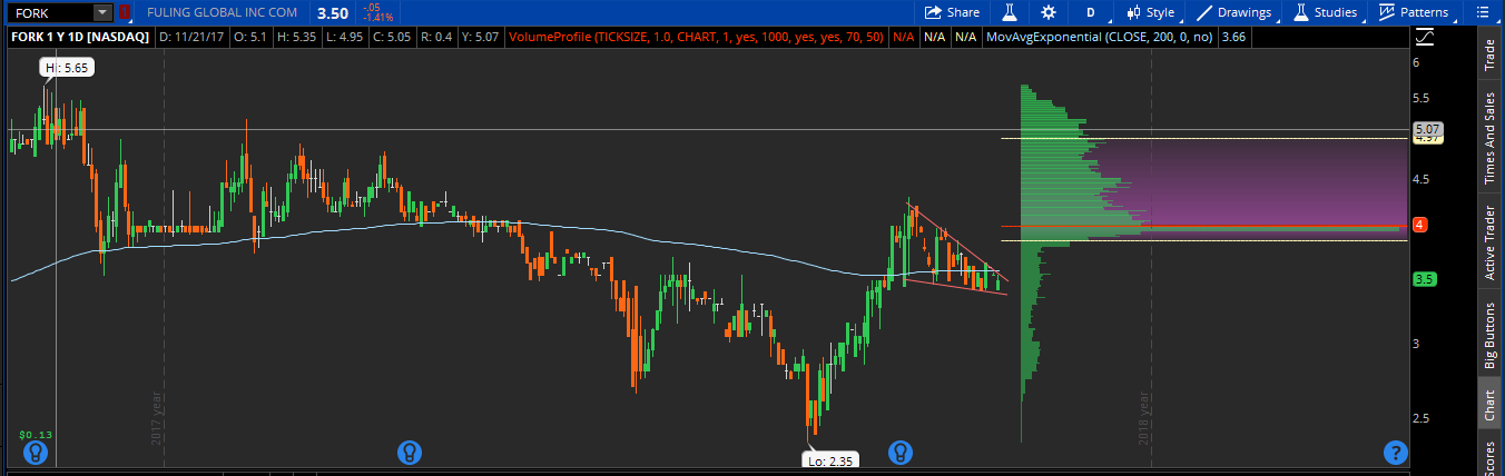
Zoomed in, FORK has a bullish flag/pennant pattern. Technicians privy to this setup know that in the right context, a breakout higher is to be expected. But what happens when you apply the volume profile to the chart? You see a VPOC level or high volume node lurking above. Just as the VPOC worked to our advantage when it was sitting just beneath our entry in BEDU, it can work to our disadvantage when it sits above a long position. We know that price will have a difficult time working its way through that $4 level, and may in fact reject there only to turn lower. That is overhead supply in technical terms or an area in which owners of the stock are happy to sell it to you and wash their hands of it. With a bulk of sellers above the stock is going to need a very strong catalyst to break through. It doesn’t mean it can’t happen but rather just that it will be much more difficult. If price is at $3.50 with a level above at $4.00 where rejection is likely is it a good risk/reward trade? That is for you to decide but at least you won’t be surprised when your trade stalls at $4.00.
Exhibit #3
$IPI
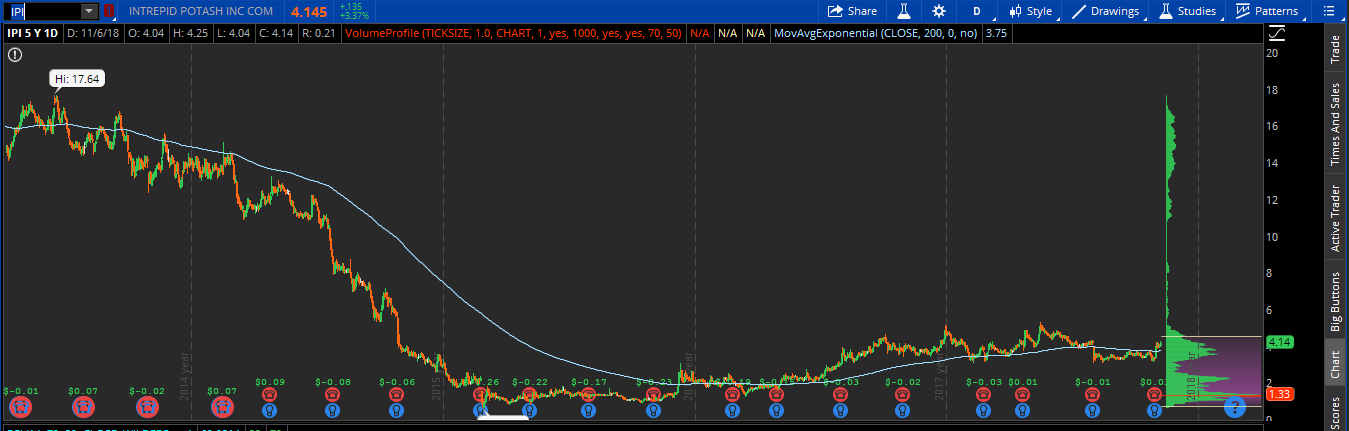
Thus far we have made mention of how price moves through the areas of high volume. What about areas where little volume exists or the thin zones? Most often it is just the opposite. Price moves quickly through these areas as there isn’t a lot of “memory” for price to fight through. For those following me since the beginning you know that I have a sizable position in the ag chemical stock Intrepid Potash. The volume profile illustrates why (among other factors). Big base has been built below over the past several years with blue skies above. I have been saying this forever but ‘it’s only a matter of time.” You’ll remember me when IPI is at $14 and think back to the good times we had.
Exhibit #4
$LULU
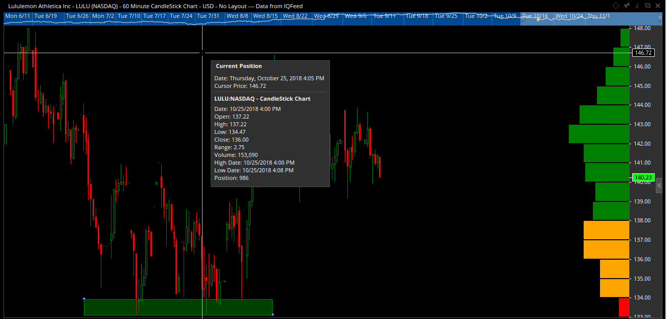
Another way I like to use Volume Profile is illustrated in the chart above in Lululemon. Certain software platforms (Like Optuma used above) allow you to change the colors of the profile allowing you to easily see levels where reversion to the mean trades are likely. For this to work, think back to your stats class in high school ( or don’t if it’s too devastating for you) and remember your lessons on the Gaussian or Bell Curve. Remember how the measure of central tendency called the average or mean was in the middle and the majority of values were within one standard deviation (I’m so sorry) above/below the mean? Then you had even more of the distribution included within two standard deviations above and below the mean? Finally you have the 3rd standard deviation which should encompass all values minus some extreme outliers. Being “on the outskirts” of the mean is not somewhere price is comfortable being. Just like you weren’t comfortable when the class average was an 80% and you got a 39. In other words once price gets too far away from home it is likely to revert back to the average. (Maybe study harder?) Look at the intraday chart above in LULU and notice how when price veered away from that green comfort zone and into unfamiliar territory yellow and finally red it continually bounced? That is not by mistake. That is your high school stats at work in the real world. Now I bet you wish you would have paid attention 😉
By no means are the above examples the only ways to use volume profile. They are two ways I have tested and proven to work time and time again. The goal should be find a way to fit this tool to your trading which leads you to more profitable trades or saves you from incurring needless losses. It’s a visual representation of where buyers and sellers are working and is one of the best derivatives of a risk management tool I know of.
Any questions?
OC