
But they can help you profit in the markets. And, being the kind, selfless guy that I am, I am going to let you in on one of mine.
Those familiar with the world of Technical Analysis have been exposed to all the classic methods of TA: Dow Theory, candlestick patterns, bullish and bearish divergences, and the hundreds of indicators out there such as moving averages, RSI, Stochastics, ATR, etc. Some of you may have gotten even more “exotic” in your approach and analyze the market using Volume Profile, Gann Analysis, or Elliott Wave Theory. Somewhat recently, I was reading an article about globally important banks and their procedures in place to manage systemic risk and volatility. (I need a life I know) I started to think about the market from their perspective, since they are the all important behemoths capable of moving prices of risk assets a significant amount. Since the passing of the Dodd Frank Act, the systemically important large banks have undergone a comprehensive regulation, including increased transparency of derivatives trading. In short, risk management is of the utmost importance, and each major financial firm has to report to the Financial Stability Oversight Council.

Think of how valuable it might be if you knew their risk models, or at a minimum some of the inputs into the equations so that you had an idea if they needed to mitigate risk, or add assets for an uptick in risk. Lucky for us, someone has already done the heavy lifting.
Kirk Northington, CMT who wrote a book on volatility based technical analysis, developed proprietary indicators that serve as support and resistance zones all you technicians are already familiar with. The difference being, these S&R Zones have nothing to do with price history. The N-Bands and VBSR Zones are based on projected and historical volatility and are forecasted into the future, giving us a whole new method by which we can choose to enter or exit our trades.
A better understanding may come from the following story:
Kirk had the privilege of sitting in the aforementioned risk management meetings at some of the biggest and most important banks post the 2007-2008 financial crisis. What was most striking to him, was the manner in which the buying and selling decisions were made based on the new risk models. Very little had anything to do with the actual yield of the instruments, price of the stock, or where the derivatives were trading. Rather these institutions were buying and selling specifically to comply with their risk rules and structure.
Our markets today are very volatility dependent. The risk models at these firms are wholly controlled by volatility levels, not where price is trading. This is something that as a retail trader, few consider. When was the last time you made a trading decision based on whether or not the future contract, equity option, or stock was trading right within your VaR level? Your ass probably doesn’t know the first thing about VaR, let alone be able to quantify the VaR of your portfolio. The days will come again when this will become important, so I suggest you at least make an effort to understand the term.
In the meantime, I will show you how the VBSR Levels look, and how you can put them to use in your #process.
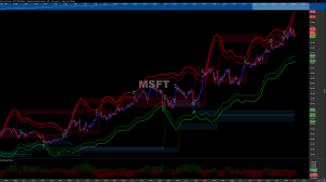
The above is a weekly chart of Microsoft, taking into account the past 5 years of price history. As you can see, we have colored bands (N-Bands) as well as shaded areas which are the VBSR Levels. Just as you would expect, the red are potential areas of resistance based on volatility while the blue areas are potential support levels where you may look to initiate a long position.
(I am intentionally leaving out the math behind these levels and will link to a video below as well as a blog series Kirk did regarding VBSR.)
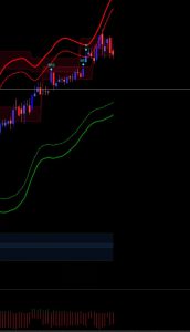
Another look at the hard right edge of the $MSFT chart above:
A couple of quick tips with the VBSR levels…
1. When the two levels of support/resistance bands converge and begin to layer on top of one another, it acts as a confirmation of sorts. In other words, a stronger support or resistance level. We can see that $MSFT here has traded up to the volatility resistance level, and that it looks to be a strong area of resistance based on the layered bands.
2. At the bottom, I have layered in a separate tool built into the algorithm called the RRR or Risk Reward Ratio. As traders, we want to take positions with the best risk reward profiles. We ain’t bout that “pickin up pennies in front of a steamroller lyfe.” Instead we wait for better pitches and swing when we see the RRR skewed in our favor. On the weekly time-frame, if I were a betting man I’d be much more apt to take a short position in $MSFT right here. The RRR tool shows very simply that $MSFT has greater downside potential.
3. I use this tool specifically for setting profit targets on option trades. 90% of the time I take directional bets on stocks using options as a vehicle to increase leverage. One of my early downfalls as a trader was knowing where to take profits. I’ve found the VBSR Resistance Zones to be a GREAT exit signal.
4. VBSR is robust. I have been testing the indicator on momentum stocks, commodities, bonds and ETFs. I’ve tested each of these asset classes on both the daily and weekly time frames, and am in the middle of testing them intraday. I can say that as exit signals they work very well on all asset classes and I’ve found the daily levels to be the most responsive levels thus far.
5. Are they perfect? Of course not. These levels should be paired as always with your other analysis techniques. You choose whether they are a valuable indicator in your process and you make them work for you.
I will leave you with one more example as to how they helped me book a gain in a recent $NVDA call position, instead of getting greedy and riding a win back down into the hole, which happens to be a signature move of mine:
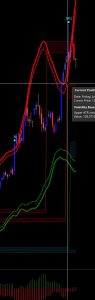
I was lucky enough to have calls on when the stock popped to the upside, leaving me with a handsome gain. After a couple weeks of higher trade after the long bullish candle, $NVDA traded into a VBRL (Volatility Based Resistance Level) signaling to me, it was time to take profits and step aside. You can see that thanks to this indicator, I made the correct decision.
VBSR Level Video: https://www.optuma.com/proweb/
Scroll to bottom of page for the video.
VBSR In Depth Blog: To Trend or Not to Trend
@omahacharts