
Shares of Green Plains Inc. have had a tough year in 2017. Losing close to 40% of their value, shares have fallen steadily from the high $20s to around $16 as we close out the year. While the stock has certainly under performed over the past 12 months, I would argue this is to no fault of their own. Their core business segments in ethanol production, corn oil production and agribusiness have been in the ebb portion of the rhythmical pattern of decline and regrowth. Other companies in the Alternative Energy space have experienced their own hardships in 2017 with Pacific Ethanol (PEIX) down over 50% YTD, and REX American Resources (REX) down 15%. In short, a difficult year in general for the group.
From a technical perspective however, shares of GPRE specifically are shaping up nicely from a risk reward perspective from the long side. The following is a weight of the evidence approach I take when considering whether or not to get involved with a new position.
A. Stock Sentiment Cycle
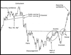
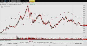
Those familiar with my work know that some years ago I was introduced to The Mamis Sentiment Cycle. The above is an illustration of the general road map a risk security will follow. Take any stock, ETF, Commodity, etc. and back out to a weekly or monthly chart. Chances are you will see your security in question mimic a version of the above cycle. Also, due to the fractal nature of markets, these also will appear on lower time frames like daily, and even intraday. Here is a 5 year chart of GPRE:
While rarely will the charts match up exact, I think the untrained eye can get a good idea where GPRE lies with regards to its sentiment cycle.
B. Depressed ATR
ATR or Average True Range is a classical indicator known well by market technicians. Developed by J. Welles Wilder Jr. originally with commodities in mind, this study measures market volatility. It is one of the few indicators I ever add to my charts as significant back testing has shown that trends in ATR can help to forecast changes in behavior of a stock, commodity or index. I think the example below can help to illustrate the basics of this:
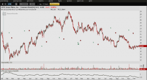
In its most basic form, when ATR is elevated you can see that declines in price often are around the corner. When ATR is low, we are in an environment where in general it is a better bet to be long. The ATR level as we sit are near the lowest point in the past two years serving as further evidence a long setup may be in the making.
C. Volume Point Of Control Support
Years ago terms like VPOC, POC, VA and Opening Drive were known to a smaller group of market participants. Even today, very few traders or investors are privy to the ins and outs of the market’s auction process. Some of the tools used by auction theorists have however moved into the new age technician’s tool box. At the very least, every one participating in markets should understand value areas, points of control, and measures of central tendency they most likely forgot about after high school statistics. Volume Point of Control or VPOC levels are the price level for the time period in question with the highest trade volume in the value area. A picture will help illustrate:
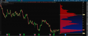
Most will recognize this as a regular price chart with the exception that the volume is flipped on the right side of the chart. This is called Volume by Price. The two yellow lines drawn on the volume study mark the top and bottom of the value area. Anything between those lines represents 70% of the traded volume. Kind of like approximately 70% of all values lie within one standard deviation of the mean in a normal bell curve? All coming back to you now? (No Celine Deon please)
Anyway, within the volume profile we have nodes. An HVN or High Volume Node area are the areas or prices where the most volume has traded. That is the taller red areas. Around $23, $19 and the special one at $16.90 which is where we sit now. The special HVN is called the Volume Point of Control we spoke about above.
So you learned something today but nobody cares. How does it help us make money? Here is how. Price travels very slowly through HVNs and quickly through the volume “pockets.” In other words HVNs act as support and resistance levels. Usually much better than the janked up trendlines I see you guys drawing. You see, the market has no idea what lines you’ve crayoned onto your charts, but volume by price is actual traded shares, contracts, etc which act as levels of support and resistance.
We are sitting right atop the VPOC taking into account a full year of volume. That is a lot of support and I don’t expect shares to trade too far beneath it. Remember how price moves quickly through volume pockets? Peep the one above… If we get a bump we should have no trouble getting to $19 quickly in the near term.
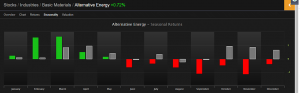
D. Alternative Energy Space Seasonality
The alt energy sector over the past 25 years shows the most strength relative to the SPX in the 1st quarter of the year. I want to get involved at the low prices we enjoy today because I am cheap and prefer to buy things on sale instead of pay more for them. I organize mass quantities of seasonal and fundamental data using Exodus Market Intelligence. Green = alt energy index. Gray = SPX. I intentionally left the raw data out. So sorry.
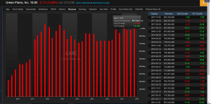
E. Revenue Trend GPRE
I’ll keep this short and sweet because we all know fundamentals are metrics used by sellers to find buyers. However, if I am going to invest in a company for any length of time, say 9-12 months it gives me warm fuzzies when I know revenue isn’t completely missing from the equation. The general trend for GPRE is just fine…
F. F For Missing The Forest For The Trees
Technical Analyst Overkill GPRE Edition:
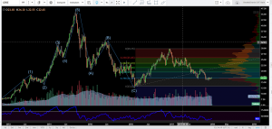
What you have in the above chart is a completed 5 Wave Impulse Sequence followed by a basic 3 Wave Corrective Sequence known to an even smaller set of market technicians called Elloticians. Following the completed 8 Wave Sequence we have moved into the next cycle. For the sake of brevity I won’t go into Elliott Wave Theory and why it works to forecast both price and time. For our purposes I will say that further to all that I have put forth above, I would argue that we are completing Wave 2 and will likely begin Wave 3 soon. Wave 3 is often longer in price than Wave 1. Wave 1 covered roughly $12 to $30 or $18 so count on Wave 3 being longer. This will come in time and will not be without pull backs but I think longer term we see GPRE between $33 to $34.
The Bottom Line: A weight of the evidence approach tells me that a long in GPRE has a much better risk reward profile than being short here. You could start a stock position right here, buying a half of a position and putting on the other half if we see a sweep of the lows this year in the mid $15s, although I am not sure we will get that chance. If you are an options guy/gal, you may notice implied volatility (read price of option premium) is very low here. I would look to take some June calls here as that gives you plenty of time.
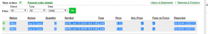
BONUS: Because I quite literally loathe people who don’t put their money where their mouth is, I’ll stuff some Benjamins into mine right here.
I just bought June calls at the $19th strike because it’s no fun when there is no wager.
Jump on in, the water is just fine.
OC