
Both the benchmark S&P 500 Index as well as the NASDAQ secured all time highs yesterday. As a betting man, my money is on the Dow and even the Russell 2000 following suit in due course. More importantly however, we want to know what is going on under the surface with the individual constituents which make up all of these indices and ETFs. We want to see stocks which are supportive of these new highs being made. I did a full market scan this morning and the results were eye opening.
Before I present those results, I want to take a step back into technical analysis 101. I respect the fact that I have a diverse reader base and terms and concepts which are second nature to some are completely foreign to others. That is helpful to us all because it is a reminder that we always need to be masters of the fundamentals. It also serves to remind us that keeping it simple is always in our best interests.
In technical analysis we give silly names to patterns made by price on charts. You’ll see names floating around like falling wedge, ascending triangle, double bottom, bull flag, etc. In the theoretical study of technical analysis, each of these patterns has their own criterion which must be met in order to qualify the pattern or discount it. In the real world, stocks, futures, or any other asset class doesn’t care about theoretical definitions. Rigid rules are made to bend but not break, and sometimes the technical patterns have been known to bend the rules.
Out of the many technical patterns, a few of which were mentioned above, one in particular has been tested time and time again with thousands of stocks over the past 100? years or more. This pattern is what market technicians call a bullish continuation pattern. All this means is that price after taking a breather from a fairly significant uptrend is expected to resume in the direction from which it came (continue onward and upward). This pattern was made famous by William J. O’Neil and is none other than the Cup and Handle Pattern.
A picture is worth a thousand words, and vice versa in this case. If you have never seen a price chart you can still conjure up an image in your mind that might closely resemble this chart pattern.
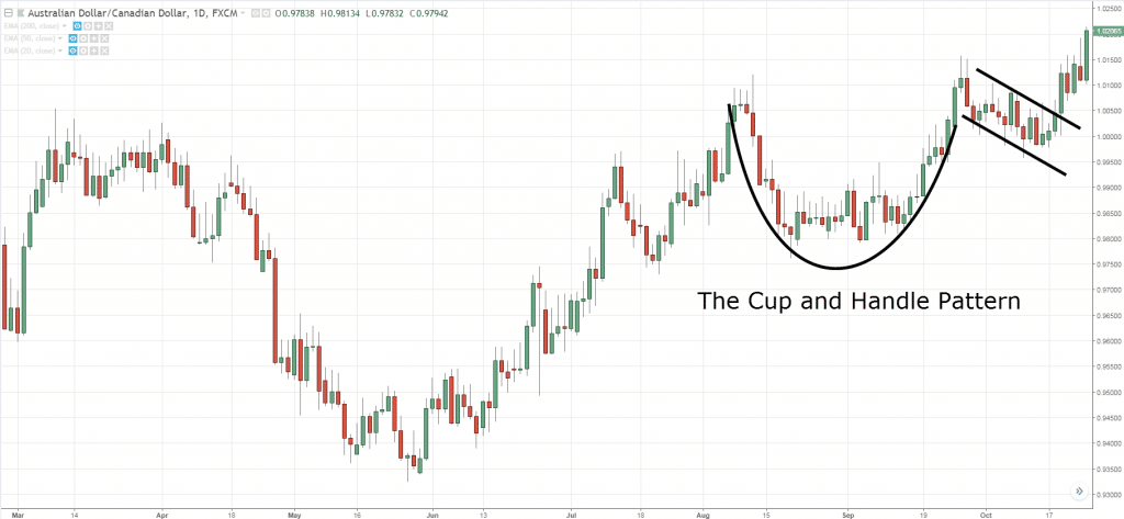
O’Neil himself pointed to four stages in a cup and handle breakout:
The security posts a significant high in an uptrend that accelerated between one and three months prior.
The next pullback carves out a rounding bottom no deeper than the 50% retracement of the prior trend. This marks the “cup.”
The next breakout attempt fails at the prior high, yielding a secondary pullback that holds near resistance, grinding out a smaller rounding bottom, which becomes the “handle.”
The security returns to resistance for the second time and breaks out, yielding a measured move target equal to the depth of the cup.
You can’t argue with the man who tested the pattern over 100k times over, nor will I. When setting up a trade the above rules are of the utmost importance because they can be the difference between a losing and winning trade. When investing it isn’t as necessary to nitpick but still you want to enter stocks that adhere mostly to the above. When scanning price charts all across the market and eyeballing patterns you want to see an overall theme and the patterns resembling some form of bullish continuation pattern. If you are long that is.
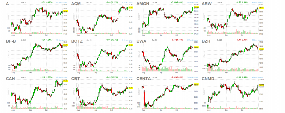
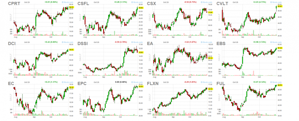
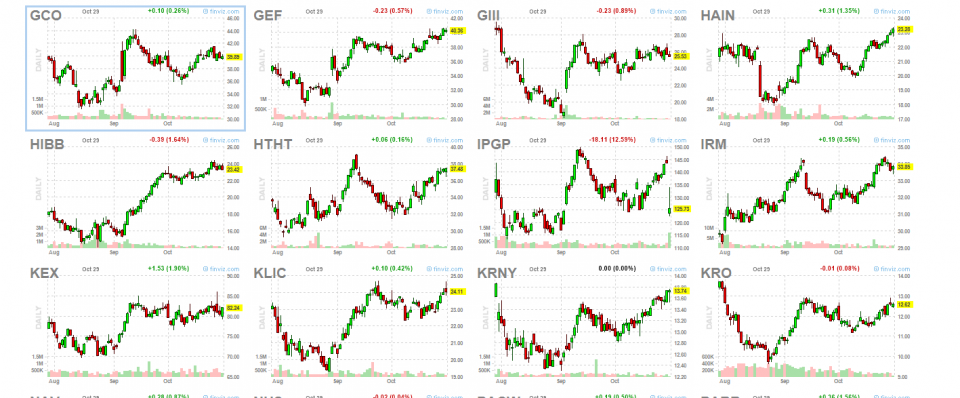
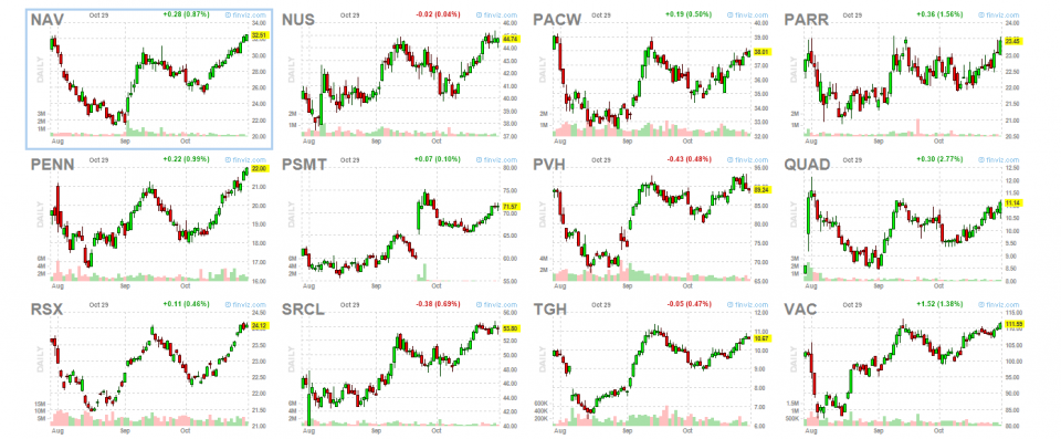
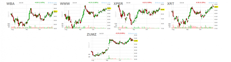
For your viewing pleasure, here is a sample of stocks which is a pretty good cross-section of the market. Compare the chart above to the thumbnails below.
What do you think?
Trent J. Smalley, CMT