
In volatile market environments, especially those on the way down, it is inevitable that we get an influx of top and bottom callers. Business news networks, financial Twitter, and finance websites are all churning out content designed to lure you in, and make you react. Not all content is ill directed, but market pundits are no more accurate in predicting market turning points than chance. Few if any of them will present an, ” I really just don’t know” stance. This won’t get them invited back on television and won’t get them clicks.
The one thing I have always tried to do is be honest with regards to market commentary. I don’t know what is going to happen. If I did I would have likely gone to cash over a month ago instead of sitting here with losses piling up on the year. What I do know though, is you have to have some framework of where to expect market turning points. In my experience the best place to turn in this regard is to mathematics, and more specifically statistics.
I’ve written ad nausea about statistics on this blog over the past couple of years, much to the chagrin of my reader base I’m sure. But I’d rather turn to math and probability than to someone who doesn’t have my best interests in mind.
A friend of mine just reminded me of a site that has been around a long time called IndexIndicators.com
While useful in many ways, there are some specific parameters you can use to return a result that has been helpful in showing market stress points. One in particular returns this chart:
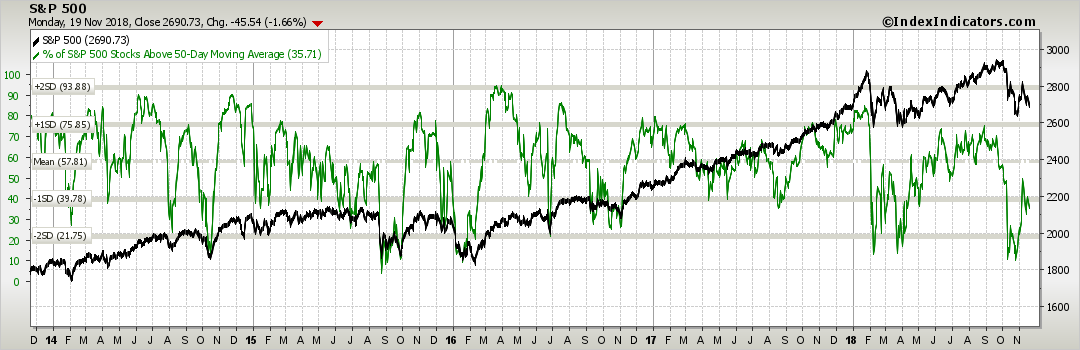
This is a chart showing the benchmark S&P 500 US Stock Index along with the percentage of those S&P 500 stocks that are above their 50 day moving average. Next, on the left hand side of the chart you see the mean number of stocks above the 50 day moving average as well as the 1st and 2nd standard deviation levels from the mean. I’ve written enough about stats previously so I will spare you here. Suffice is to say, these deviations away from the mean represent stress (turning) points which can often be relied upon to help us spot top and bottom levels, in this case for the S&P 500 Index.
Notice that when the percent of stocks above the 50 day falls to those 2nd STD DEV levels (the green line) the S&P rallies. In turn, on the top side, the first STD DEV from the mean often precedes a short term market top. This is just math at work. When enough stocks in the index fall to certain statistical levels buyers step into as they perceive value or may believe we are oversold. When too many stock in the index overheat, profit taking occurs and the index drops.
There are countless other overbought and oversold indicators that market pros monitor in attempt to forecast market direction. What is most important is they are armed with data, they use it correctly, and they come with results that are reproducible. The above has worked fairly well over the past 5 years.
I’ll follow it much closer than I will whoever is on CNBC with a suit and pocketquare.
Hang in there.
OC