
Now that the first half of 2019 is in the books, we can look back historically at how the SPX has performed in the second half of a year in which equities got off to a roaring start. This morning the Wall Street Journal ran an article detailing historical performance of the S&P 500 benchmark in the second half of the year after the index posts a first half gain of 15% or more. Here is a graphic from that article:
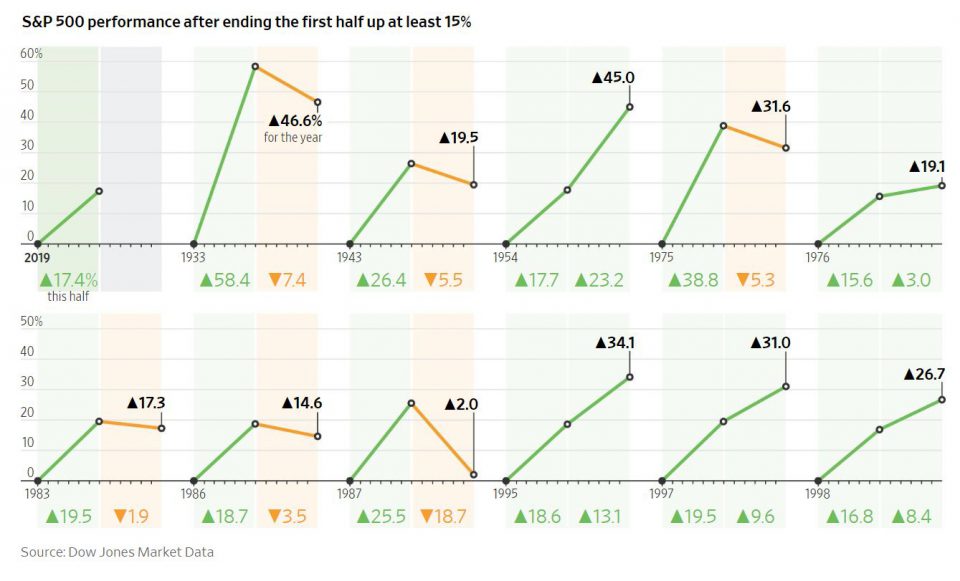
There are a couple of takeaways from the above image with regards to historical performance of the US Equity Benchmark. The first is that when the SPX is up between 15-20% in the first half of the year, more often than not the index goes on to make higher highs into year end. However, years when we see the SPX up greater than 20% in the first half of the year, we have seen stocks pare those gains into year end. So, can we draw a simple conclusion that because the SPX was up 17% in the first half of this year, we are guaranteed to see the index higher by year end?
Of course not. We are never guaranteed anything from markets. What I can guarantee you almost unequivocally is that in the second half of the year, one ratio in particular will look a whole lot different if we are to see US equity markets continue on their upward trajectory.
That ratio is that of the Russell 2000 Small Caps (IWM) to the SPY (S&P 500 ETF). Let’s take a look…
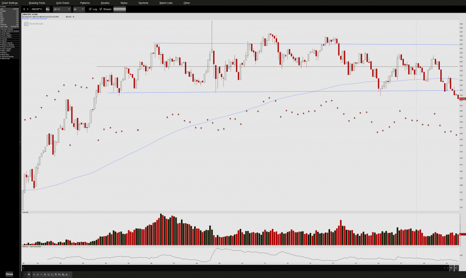
The above is the ratio of IWM/SPY looking back 20 years, using monthly candles to drown out some of the noise. While not a perfect rectangle pattern, I think this illustration of what we consider small cap and perhaps riskier stocks to their larger cap, more stable counterparts is signalling we are at a turning point. By this I mean, if we are to go on to inch out further gains in the second half of the year in stocks as a whole, you are going to see this ratio bounce, and begin to move up toward the midpoint inside the pattern.
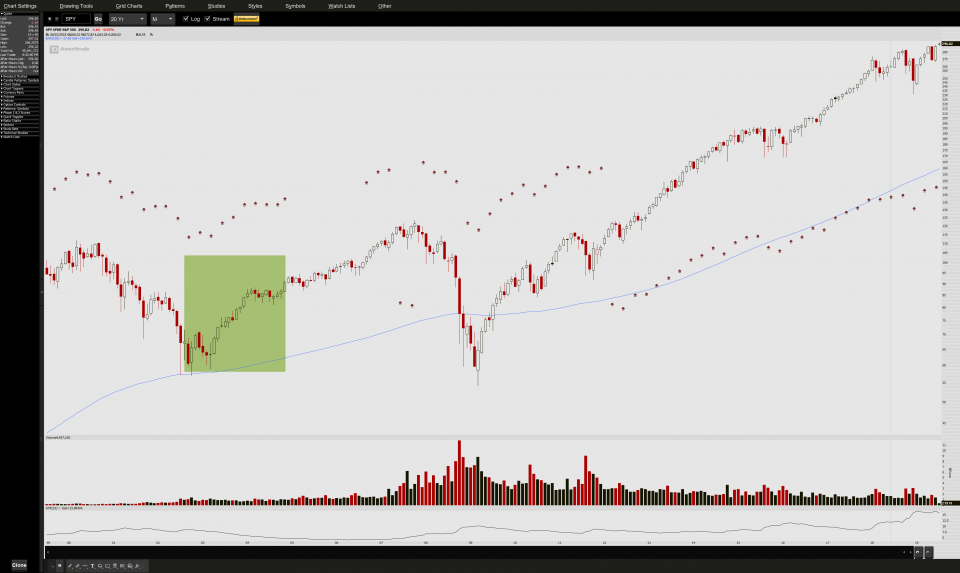
The IWM has of course been lagging its peer group in the US Equity Market thus far YTD. The bad news is that the IWM/SPY ratio as shown above hasn’t been this low since mid 2003. The good news is that the last time the ratio was this low the SPY reacted as follows shown highlighted in green below:
Are there any clues to suggest that our IWM “Risk On O-Meter” might be looking to finally have its day? I think there is an interesting setup here awaiting.
Take a look at the ever so slight bullish momentum divergence here in our aforementioned ratio chart:
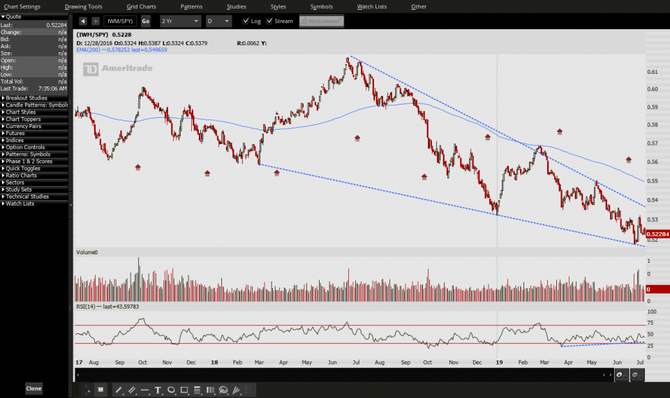
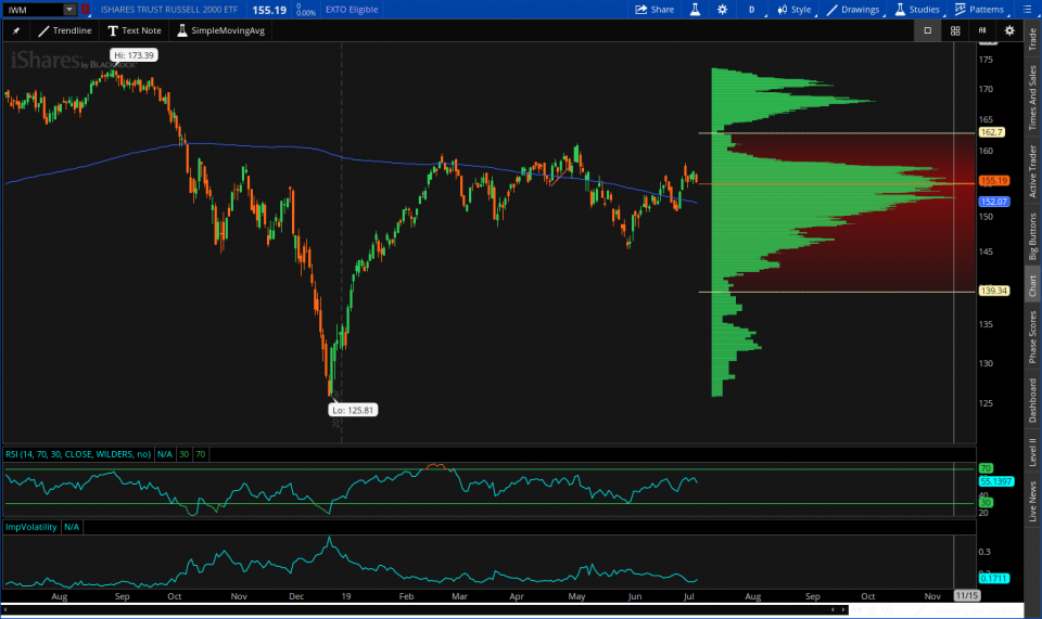
Further to that, IWM has volume support just below current levels aplenty:
The two heaviest sector weightings making up over 30% of the IWM are financials and healthcare. We will want to keep an eye on these two groups in particular and look for strength in them to aid in IWM catching up to its peers.
I think the rest of the year depends on it.
Trent J. Smalley, CMT