[vc_row el_id=”US Banks diverging against yields”][vc_column][vc_column_text]
US Banks diverging against yields
Making everything more “objective” is generally good in life but making everything more “objective” when trading or investing is an absolute must if you aspire at a reasonable degree of success. Teaching yourself some basic stats principles will help a lot as you attempt more objectivity in your decision-making process.
As a market technician you can pick and chose any method you want – quantitative analysis, cycles, sentiment, chart patterns, candle patterns, basic trend analysis, money flow analysis or breadth – and anything in between. But you must always apply them within the framework of the Dow Theory because if you don’t do that your work can be qualified as ANYTHING BUT true analysis of market behavior.
A key concept under the Dow Theory, indeed in the entire body of technical analysis, is that of confirmation / non-confirmation. It does matter when volume, momentum and open interest confirm the trend or not; when the Canadian Dollar follows developments in the Oil market or it doesn’t; when Ausie (AUDUSD) diverges from Gold or it mirrors it; or when energy stocks confirm cash energy prices or fail to do so for that matter. There is more than one path you can adopt to objectively measure such in or out of sync movements between related markets, the most obvious one being correlation.
There are two points you need to know regarding correlation. First-off, correlation does not imply causality. This is perhaps the first thing taught about correlation in any stats course. If the USDCAD exchange rate is correlated to the price of oil, it does not mean that rising CAD automatically leads to higher oil prices and falling CAD automatically leads to lower oil prices or vice-versa. The causality relationship is asymmetric for different CAD and Oil price points and like everything else in the markets it fluctuates according to certain trends in mass psychology. Secondly, correlations are time dependent meaning that they persist for a while but they ultimately become well-known and universally accepted, at which point they are fully discounted in the price – which in turn means they lose relevance and thus begin to weaken. And then some other force is recognized and accepted by the market as “more relevant” and dictates new patterns of market correlation.
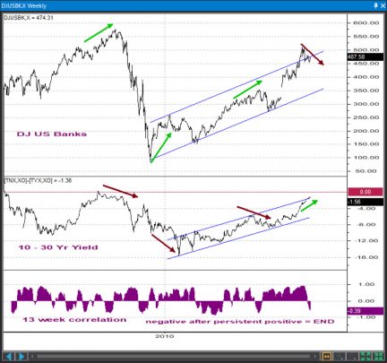
The chart I wanted to take a look at today was the one comparing the Dow Jones US Banks Index and the 10 Year – 30 Year Yield spread because it may give us hints where we are in the overall stock market cycle. If the value of the shares making up the index can be viewed as the horse power of the engine called US banking system whose role is to move the car called the US economy, the yield spread can be viewed as the octane of the gasoline it “sips”. Higher octane should lead to more horse power and torque and when it doesn’t it either means the octane may not be that high after all or there may be something wrong with the engine itself.
You will note that in the past when the 13 week correlation between the spread and the index dipped into negative after periods of persistently positive (i.e. “normal”) values, it generally signaled a reversal of some nature. Since the beginning of this year, the spread continued to trend higher while the index was at best sideways and in fact trending marginally lower at times. The only possible conclusion here is that as the interest rates continue to rise and the tail-end of the yield curve flattens, US banks’ earnings are actually beginning to suffer – perhaps as higher interest rates take a toll on consumer spending and investment decisions. The higher octane can no longer squeeze more horse power out of the engine but rather begins to fry the engine’s head gasket. It’s a matter of time till the engine ultimately overheats and stalls.
The implication of this is that the primary stock market uptrend is giving the first hints of weakness. Before long, some crackdown in the major indices themselves and a rotation to more defensive sectors and groups are likely to transpire. If this whole situation had persisted for 9-12 months and the yield curve would have already been inverted we would probably be compelled to strike an even more pessimistic tone. For now, we will claim to be just cautious optimists though admit we feel nervous enough to constantly sniff for signs of an approaching market correction.
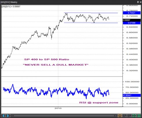
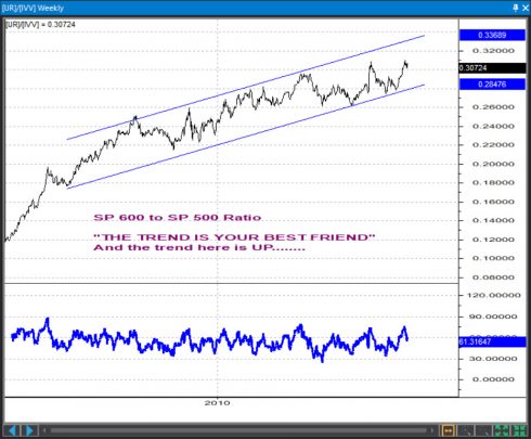
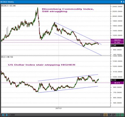
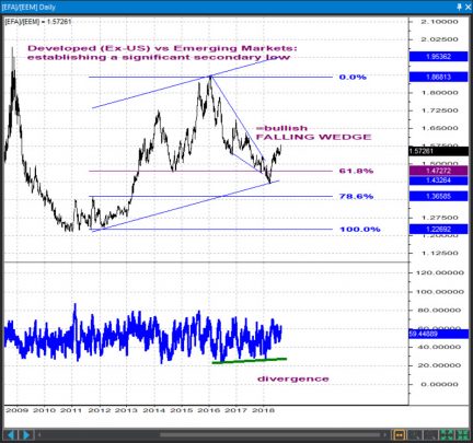
Obviously, rising USD interest rates have many ramifications. Domestically, this leads to Small and Mid cap outperformance vs Large Caps. In currency and commodity markets it translates into higher USDollar and lower commodity prices. And since emerging economies largely produce commodities whereas developed economies largely transform them into high-tech products this weakness in commodity prices is one of the factors behind developed vs emerging markets outperformance. The charts below are simply cousins of the previous one we’ve shown above and have “LATE CYCLE DEVELOPMENT” written all over them. But overall, while we have to conclude a top is in the making we also have to conclude it has likely not formed just yet……
 [/vc_column_text][/vc_column][/vc_row][vc_row el_id=”SP 500″][vc_column][vc_column_text]
Pattern Analysis
S&P 500, Daily
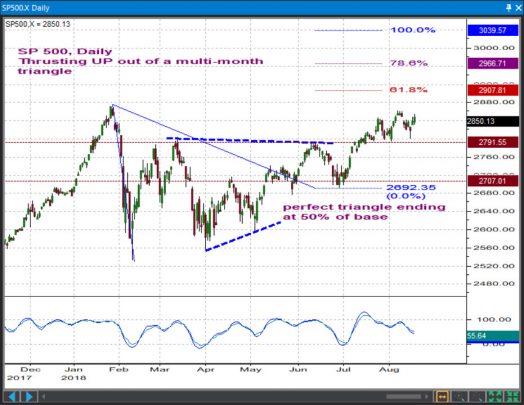
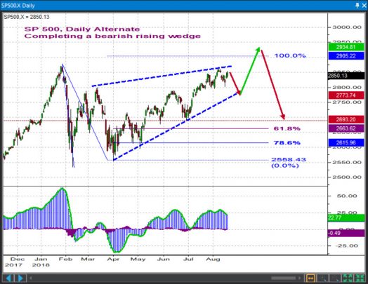
You want to give priority to the immediate uptrend while we trade above 2791 and gather energy for a push towards 2907 / 2967. Alternatively, allow for a retest of 2692 – 2707 if prices dip below 2791
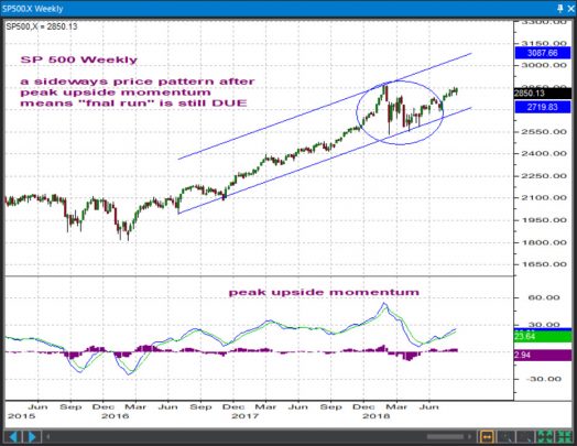
S&P 500, Weekly
From a weekly chart perspective, whether we thrust out of a sideways triangle or we complete a more bearish rising wedge, the intermediate-term uptrend would ideally look complete only AFTER a push to a new high – one that will likely develop on a backdrop of a bearish momentum divergence. We favor selling into strength in this time frame.
 [/vc_column_text][/vc_column][/vc_row][vc_row el_id=”SP 400″][vc_column][vc_column_text]
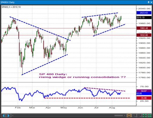
S&P 400 Mid Cap, Daily
The recent price action contains elements that make the Mid Caps prone to an immediate hit but a momentum component we watch currently disagrees. Allow the immediate uptrend to carry towards 2060 – 2080 but only while prices continue to trade above 1933 – 1961. Below that zone the risk is for a drop back towards 1840 and then 1780.
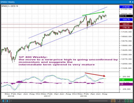
S&P 400 Mid Cap, Weekly
Irrespective of the ultimate form we’ll trace out in this short-term up cycle from the spring lows, chances are the larger intermediate-term uptrend from the 2016 lows is maturing. We’re sellers into strength in this time frame.
 [/vc_column_text][/vc_column][/vc_row][vc_row el_id=”SP 600″][vc_column][/vc_column][/vc_row][vc_row][vc_column][vc_column_text]
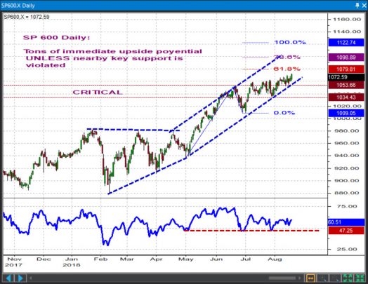
S&P 600 Small Cap, Daily
We’ll stay bullish while prices trade above the 1034 / 1054 key short-term supports in expectation of a rally towards 1080 / 1099 / 1123. We will get out of the way / go short below 1034 for a retest of 1009 / 980 / 940.
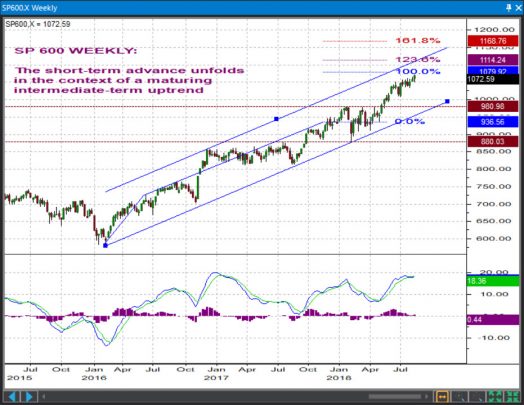
S&P 600 Small Cap, Weekly
The intermediate-term cycle from the 2016 lows is showing signs of fatigue so any short-term strength ought to be interpreted in the context of a maturing mid-term uptrend. Selling into any strength to book profits on existing long positions is a wise thing to do from an investor perspective.
 [/vc_column_text][/vc_column][/vc_row][vc_row el_id=”DJIA”][vc_column][vc_column_text]
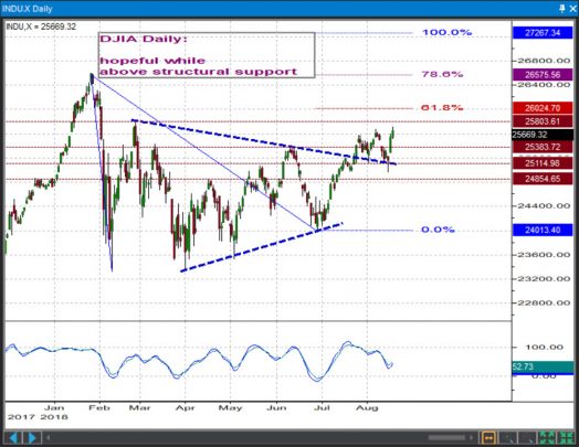
Dow Industrials, Daily
Whereas the Mid and Small caps look a bit better than the S&P 500, Dow’s own pattern looks more mediocre than that of the SPX. Any short-term hopefulness in the DJIA will have to be defended at the 24854 – 25114 short-term supports and pushes above 25804 – 26024 will have to be required to breath much needed confidence in the overall short-term uptrend.
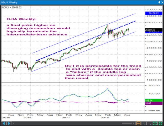
Dow Industrials, Weekly
The problem the DJIA faces right now is that yes, the intermediate – term uptrend would typically complete with a push to a new high on diverging momentum but no, such a push is not an absolute must because the force and persistence of the 2017 rally handsomely allow for the formation of a double top or even a “failure” (a situation when the final leg of a trend does not manage to achieve a new price extreme)
[/vc_column_text][/vc_column][/vc_row][vc_row el_id=”DJTA”][vc_column][vc_column_text]
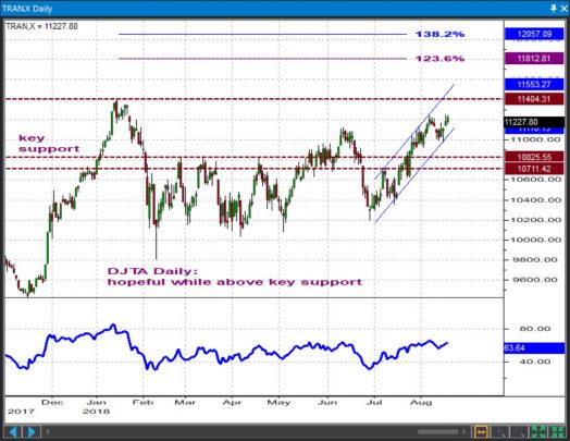
Dow Transports, Daily
We will maintain a positive overall outlook while prices remain above the 10711 – 10826 key supports. Targets / resistances come in at 11404 and then at 11812 / 12057
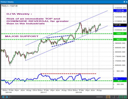
Dow Transports, Weekly
The inability to build any meaningful upside momentum following that successful retest of trendline support earlier this year is worrisome, especially since at the early 2018 highs the Tranies already posted a bearish momentum divergence. From a Dow Theory perspective, a new high in the DJIA / SPX / Mid and Small Caps that goes unconfirmed by the DJTA would be both a terrible setup and, historically, the typical way to end a mid-term uptrend.
 [/vc_column_text][/vc_column][/vc_row][vc_row el_id=”DJUA”][vc_column][vc_column_text]
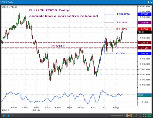
Dow Utilities, Daily
We’re patiently awaiting for a downside reversal from below the 759.59 – 775.67 resistances and a push below the 711.26 – 720.79 support zone.
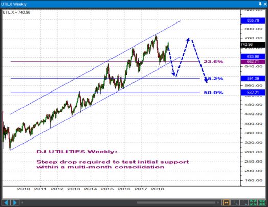
Dow Utilities, Weekly
With the back-end of the yield curve pushing higher and with a seemingly complete 2010-2017 bull run which as you can see developed nicely inside two parallel channel lines, odds favor a sharp retreat in the utilities. We’re targeting the 590-620 area at some point in late 2018 / early 2019.
 [/vc_column_text][/vc_column][/vc_row][vc_row el_id=”PICK 1″][vc_column][vc_column_text]
Hot Stock Picks
BLUE
| SYMBOL | DIRECTION | BUY ZONE | SELL ZONE | RISK / REWARD | VEHICLE |
| BLUE | UP | $151 – 160 | $235 – 245 | – $10 / + $75 | Options |
$BLUE has been exhibiting a falling wedge pattern, consolidating through price and time a bullish run that has been nearly uninterrupted since the end of 2016. Coming into the week of 8-19-2018 biotechnology is exhibiting strength relative to the S&P 500 Index so we want to make sure we are involved here. Would buy any dips in the coming week using options or stock. Looking for a return to highs seen in March by year end. Look at the $200 or $210 strike calls for November to manage risk.
[/vc_column_text][vc_single_image image=”5735″ animation_type=”fade”][/vc_column][/vc_row][vc_row el_id=”PICK 2″][vc_column][vc_column_text]
GERN
| SYMBOL | DIRECTION | BUY ZONE | SELL ZONE | RISK / REWARD | VEHICLE |
| GERN | UP | $3.60 – $4.00 | $4.80 – $5.00 | – $0.20 / + $1.00 | Stock |
GERN recently broke upward outside of a “pennant-ish” pattern. The end of March saw a huge run up accompanied by large volume and has since digested those gains. The recent breakout is bullish, and we can measure the potential move using measured move analysis. By the end of the year I think we can expect to see the stock back near $5.00, with very defined risk to the downside. This is a speculative name so adhere to strict risk management rules, but overall I believe the upside far outweighs the downside.
[/vc_column_text][vc_single_image image=”5740″][/vc_column][/vc_row][vc_row el_id=”PICK 3″][vc_column][vc_column_text]
ATI
| SYMBOL | DIRECTION | BUY ZONE | SELL ZONE | RISK / REWARD | VEHICLE |
| ATI | UP | $24.25 – $26.00 | $29.00 – $30.00 | – $1.50 / + $5.00 | Options |
ATI has been bouncing between a very defined support and resistance line. These patterns give us very defined zones to get in and out of stocks. It is also testing a defined Fibonacci Retracement Level. Also, the general RSI Indicator has been a great buy indicator any time it has fallen to the oversold 30 level over the past 18 months. Look for an immediate term move back to the midpoint of the range near $27. This can be easily played via stock or options, the closer the buy to $25 the better.
[/vc_column_text][vc_single_image image=”5734″][/vc_column][/vc_row][vc_row el_id=”PICK 4″][vc_column][vc_column_text]
CMC
| SYMBOL | DIRECTION | BUY ZONE | SELL ZONE | RISK/REWARD | VEHICLE |
| CMC | UP | $20.50-22 | $25-26.75 | -$1.00-+$5.00 | OPTIONS |
CMC is consolidating in a symmetrical triangle pattern with major support holding near the 1 year Volume Point of Control (VPOC). In my opinion though price broke below the lower trendline, this is the making of a failed move which results higher. Those paying attention to the Volume by Price point of control see candles leaving a lower shadow near the area, signaling bulls defending the area. Look for a bounce back up to the higher trendline and ultimately breaking out to make a move back to the high $26s.
[/vc_column_text][vc_single_image image=”5737″][/vc_column][/vc_row][vc_row el_id=”PICK 5″][vc_column][vc_column_text]
GS
| SYMBOL | DIRECTION | BUY ZONE | SELL ZONE | RISK/REWARD | VEHICLE |
| GS | UP | $230-236 | $255-260 | -$3.00-+$25 | OPTIONS |
On the daily chart, $GS is putting in a fairly pronounced inverted head and shoulders pattern. We want to watch closely how price reacts once it trades back to the neckline. Should it trade above the neckline we are set for prices to move back towards the upper end of the value area which is the light yellow line. If price rejects which I don’t believe it will, you can bring stop levels up. This is a great time to make use of options in $GS as the implied volatility levels are very low (price of premium is cheap).
[/vc_column_text][vc_single_image image=”5742″][/vc_column][/vc_row][vc_row el_id=”PICK 6″][vc_column][vc_column_text]
CELG
| SYMBOL | DIRECTION | BUY ZONE | SELL ZONE | RISK/REWARD | VEHICLE |
| CELG | UP | $85-90 | $105-$110 | -$5.00-+$15.0 | OPTIONS |
CELG is a component of the $XLV ETF which has been exhibiting relative strength as compared to the benchmark S&P 500 Index. When a group is strong, we want to be involved, especially in names with patterns or setups that give us a good risk/reward opportunity. Like $GS, $CELG is putting in an inverted H&S pattern (albeit a bit sloppy). Watch for a bit of a pullback to carve out the right shoulder giving you an opportunity to get in lower before it reverses higher to test the neckline (in blue). If price trades above the neckline and confirms the inverted H&S, watch for $CELG to hit $105-110.
[/vc_column_text][vc_single_image image=”5736″][/vc_column][/vc_row][vc_row el_id=”PICK 7″][vc_column][vc_column_text]
CRON
| SYMBOL | DIRECTION | BUY ZONE | SELL ZONE | RISK/REWARD | VEHICLE |
| CRON | UP | $5.60-6 | $10-11.00 | -$1.00-+$4.00 | STOCK |
You won’t find a more text book pennant pattern in the equity markets. Simply put, these patterns when price movement is strong leading into the pattern should resolve to the upside. Of course, text book patterns are meant to fail, but the risk reward here is so defined, we would be remiss not to get involved to the upside.
[/vc_column_text][vc_single_image image=”5738″][/vc_column][/vc_row][vc_row el_id=”PICK 8″][vc_column][vc_column_text]
GOOGL
| SYMBOL | DIRECTION | BUY ZONE | SELL ZONE | RISK/REWARD | VEHICLE |
| $GOOGL | UP | $1215-1220 | $1260-1270 | -$5-+$40 | OPTIONS |
On Friday, $GOOGL left a long lower shadow as buyers defended the level where price gaped higher on high volume in late July. This is a bullish setup that has the potential to reverse higher almost immediately. The market shows its hand when sellers are unable to push price lower, leaving a lower shadow into a gap. I love this to make a move higher in the early going this week.
[/vc_column_text][vc_single_image image=”5741″][/vc_column][/vc_row][vc_row el_id=”PICK 9″][vc_column][vc_column_text]
DAN
| SYMBOL | DIRECTION | BUY ZONE | SELL ZONE | RISK/REWARD | VEHICLE |
| $DAN | UP | $19-20 | $24-26 | -$1-+$5 | STOCK |
This particular setup in $DAN is one you won’t find in any traditional technical analysis textbook. However, I have seen this setup often enough to know it presents us with an upside opportunity with defined downside. This is a daily chart, taking into account 5 years of price history. Price has come directly into the volume point of control, in short the price level where the most amount of shares have traded in the time frame in question. As price fell to this “magic level” it did just what I expected it to on Friday, it bounced. Expect it to trade higher. Making it easy, if price trades below the VPOC, we take the trade off and move on.
[/vc_column_text][vc_single_image image=”5739″][/vc_column][/vc_row][vc_row el_id=”PICK 10″][vc_column][vc_column_text]
SONO
| SYMBOL | DIRECTION | BUY ZONE | SELL ZONE | RISK/REWARD | VEHICLE |
| $SONO | UP | $16.80-18 | $23.50-24 | -$2-+$5 | STOCK |
Perhaps the most speculative of the names included this week is that of $SONO, a recent IPO. While we don’t have much price action yet to analyze, on the intraday time frame I like the look. Price has recently broken out of a descending triangle and is exhibiting a pennant pattern after the breakout. When trading new IPOs realize that options are often the best bet, provided the spreads aren’t wide. If not options, use a stop order near $16.75.
[/vc_column_text][vc_single_image image=”5743″][/vc_column][/vc_row]

